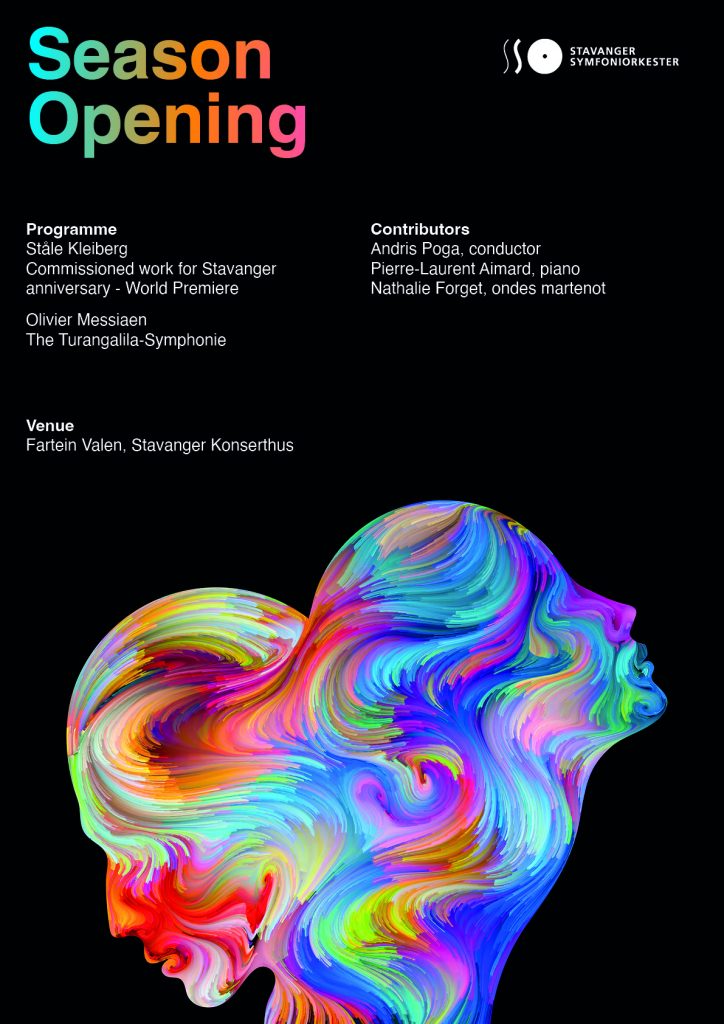
GRAPHIC DESIGN HISTORY: MODERNIST ERA
1.1 Lesson - Why Graphic Design History is Important
It will be beneficial to get a broad overview of the field of the modern history of graphic design. Discover the power of imagery with Sean Adams in this LinkedIn Learning course.
Sean Adams managed the AIGA historical archives – the largest collection of graphic design history in the world. In this course, he focuses on the hows and whys of each design movement, detailing the development and evolution of specific styles, techniques, and genres.
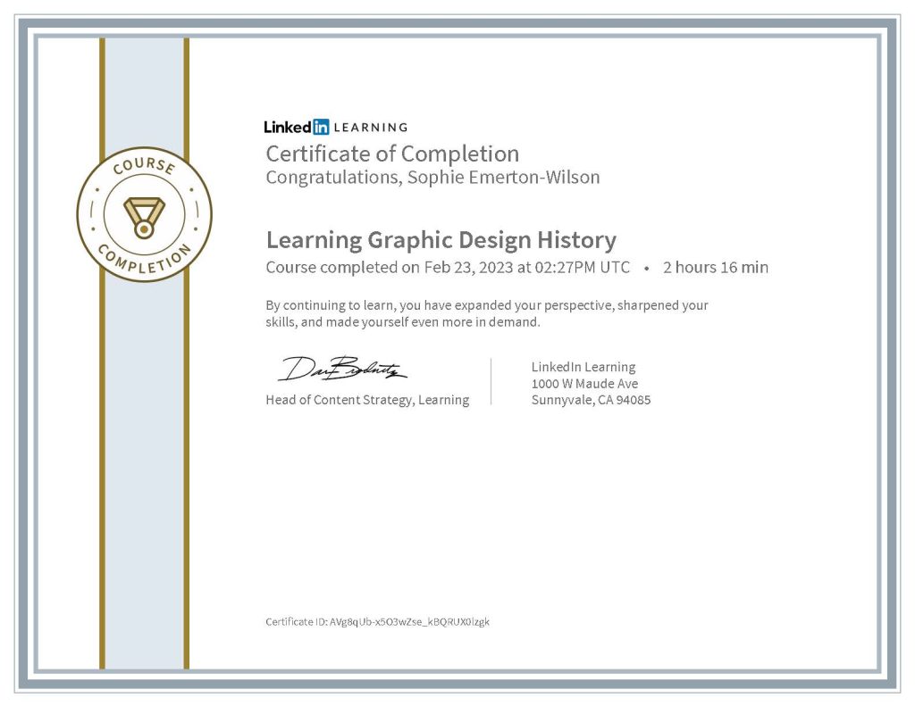
Below is my LinkedIn Learning certificate from this course:
Additional Task
Brief: Create a horizontal timeline and make rough notes as the course goes on. It does not need to be neat or technically correct in every way – it’s just a way for you to understand how the periods overlapped and influenced eachother.
(This additional task will be uploaded at the end of the course)
1.2 Lesson - Suprematism and Constructivism
Brief: Describe the similarities and differences between Suprematism and Constructivism. Show that you understand the movements in broad terms.
- For each of these movements, find examples from their eras and then two contemporary designs you think are influenced by these styles.
- Explain in your own words how you can see the influence of Suprematism and Constructivism in these modern-day designs.
Suprematism and Constructivism are two opposing art movements both of which originated in Russia during Russia’s revolutionary period and promoted geometric abstraction.
Suprematism was started by Kazimir Malevich and influenced the development of Constructivism, founded by Aleksander Rodchenko and others some years later. Both movements were short lived, and by the 1930’s, had come to an end. However, both styles had a lasting effect on the art world, especially graphic design.
Whilst both styles share some things in common, they also have their differences.
Suprematism was about the idea of a supreme reality – pure feeling with no attachment to objects of the visual world, while Constructivism took another direction, giving Suprematism’s design elements function and transforming them into political statements.
Suprematism used simple forms and geometry and was considered non-objective art. Artists of this style believed that art did not need to serve any function beyond it’s intrinsic, spirital value. On the other hand, Constructivism rejected the mysticum and philosophy of Suprematism, and instead, viewed art as a practice directed towards social change or social purpose, abstracting and reconstructing the elements of visual art.
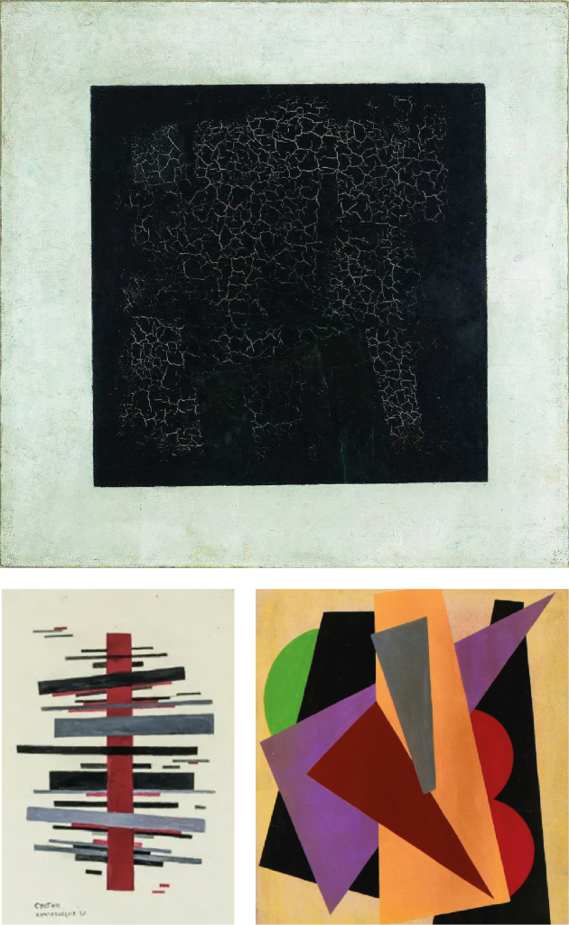
Suprematism
Suprematism Era
Contemporary Designs
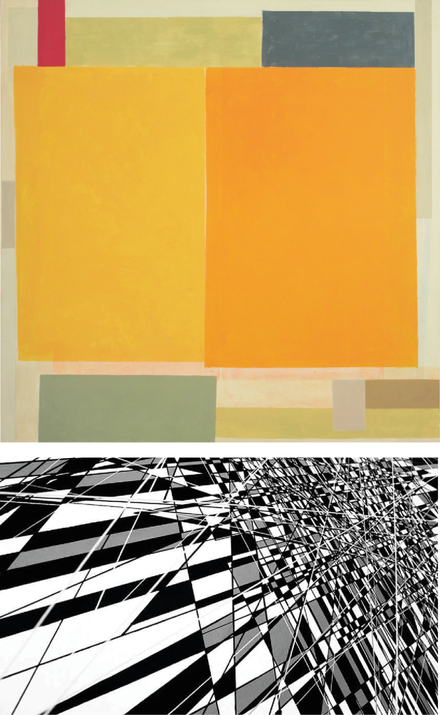
Suprematism era artwork by Kazimir Malevich, Nikolai Suetin, and Lyubov Popova is shown next to these two contemporary designs by Elizabeth Goulay and Thomas Canto to show how the Suprematism style has influenced these modern-day artworks. Both pieces are non-objective, show self-expression, and feature simple geometric forms. Gourlay’s work shows a series of rectangles of different dimensions organised across the canvas, and while Canto’s work looks very complex, it is still obviously inflenced by the Suprematism style, featuring basic geometric shapes and lines. These artworks are not of any particular thing, or person, and like the works from the Suprematism era, there is no wrong or right way to look at these pieces.
Constructivism
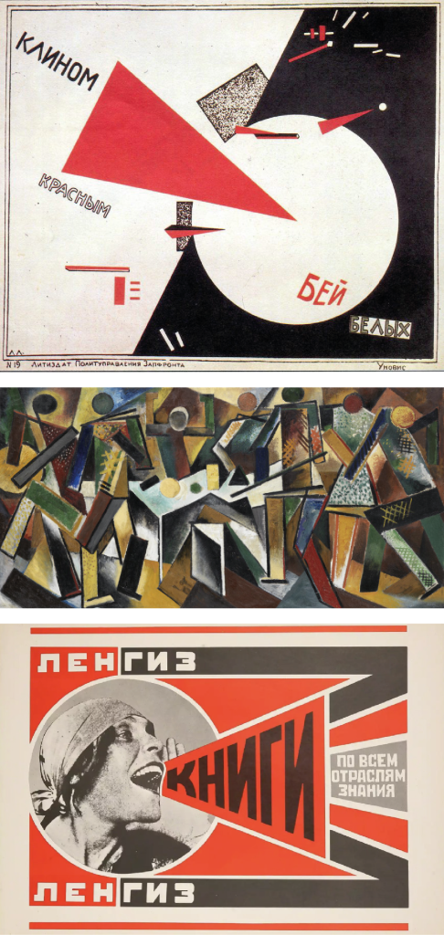
Constructivism Era
Contemporary Designs
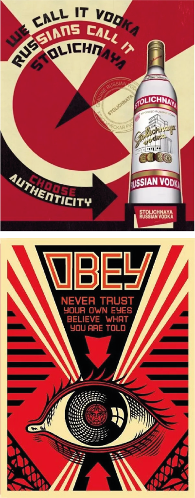
Constructivism era artwork by El Lissitzky, Varvara Stepanova, and Aleksandr Rodchenko is shown next to these two contemporary designs – one for a Stolichnaya Vodka advertisement and the other, a piece of artwork by Shepard Fairey to show how the Constructivism style has influenced these modern-day artworks. Geometric forms are used in both pieces, and feature either an image or an illustration, in combination with typography. They are constructed to show meaning – there is purpose and function to these pieces. The imagery and colours are bold to catch the eye. The Stolichnaya Vodka advertisement shows an image of the product with an arrow pointing to it – this piece is very clearly influenced directly by Lissitzky’s “Beat the Whites”, and while Fariey’s work is more influenced by propaganda using the Constructivism style, both are speaking directly to the viewers with a clear message.
1.3 Lesson - De Stijl and Bauhaus
Traditionally, pixel art was not seen as art at all, it was merely seen as a way for, particularly video game developers, to use a limited number of pixels to create images. But it’s really a lot like abstract art: it represents a pictorial element in its simplest, purest form using only squares and flat colours. It forces the creator to focus and isolate only what is most important in an image without providing the finer control you could apply in a more detailed drawing style. Think of it as modern-day Piet Mondrian.
Brief: Build a pixel art version of one of the options below as a vector image in Adobe Illustrator. The idea is to make something that’s as simple as possible, using a limited number of pixels and flat colours.
Focus only on the most necessary details.
For my pixel art, I chose to option 1 from the brief – “use any face, and create a square pixel avatar.” I created a pixal art version of ‘Kratos’, the main protagonist from the popular video game franchise, ‘God of War’. I attempted three different versions, but this one turned out best. This was my first time creating pixel art, so I’m quite satisfied with the outcome.
My Pixel Art
Original Image

1.4 Lesson - The International Typographic Style
Design a simple, yet striking poster using the Swiss Style Grid.
Brief: Design an A2 poster for a Stavanger Symphony Orchestra concert. The concert consists of two parts. The first is a commission from local composer, Ståle Kleiberg, who’s know as a composer for grand occassions. The Turangalila-Symphonie by Messiaen follows the intermission, which according to the composer, is a love song.
Use the Swiss Style Grid to organise the information and the type face ‘Helvetica’. Place the main focus on the image and heading.
The heading of the poster should be ‘Season Opening’.
The rest of the information that needs to feature is the following:
PROGRAMME
Ståle Kleiberg
Commissioned work for Stavanger anniversary – World Premiere
Olivier Messiaen
The Turangalila-Symphonie
CONTRIBUTORS
Andris Poga, conductor
Pierre-Laurent Aimard, piano
Nathalie Forget, ondes martenot
VENUE
Fartein Valen, Stavanger Konserthus
Image: Choose a main image to complement the information.
Feel free to make more than one poster by simply replacing the image and changing the mood of the design completely.
Using the information given, I created two versions of a poster for the concert. I wanted to stay away from typical imagery, such as anything music-related and focus more on a key piece of information within the brief “love song” – I wanted a somewhat non-obvious or abstract image to represent this.
The first poster is my main design, and the second is the outcome after a change of imagery and colour:
