IMAGES & LAYOUT WITH CSS
3.1 Lesson - Styling Images
You need to create an HTML and CSS document for this lesson task. Use one root folder containing separate CSS and image folders. Find three images you can use; one for a background, one for part of the content, and one simple PNG with a transparent background.
Part 1
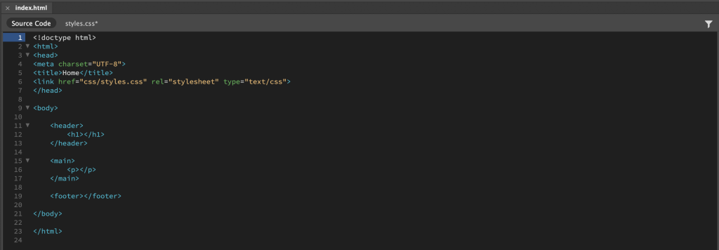
Brief: Create a basic structure for the HTML document with a <body> containing a <header>, <main>, and <footer> section. Insert an <h1> element into the <header> section and a <p> element with text inside the <main> section.
Using CSS, apply the following into the HTML page:
- A background image for the <body> section.
- A solid background colour for the <header> section, but with an opacity rule applied so that the background image is slightly visible behind the <header> container.
Once you have the background image showing, apply different values to the background properties that will produce the following results:
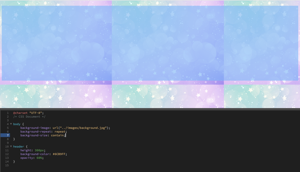
- A repeated pattern of the background image using the properties “background-repeat” and “background” size.
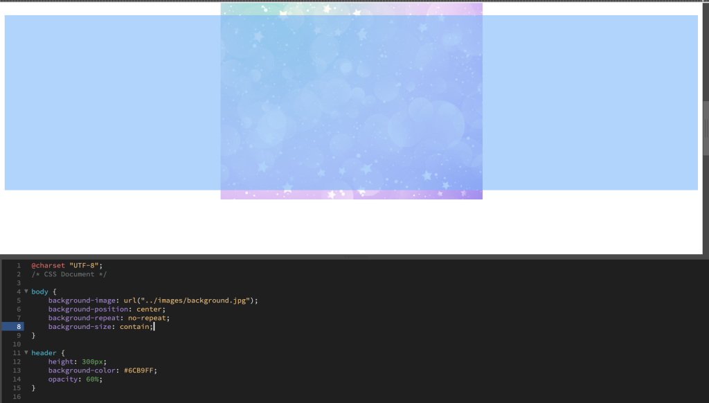
- Place the background image in the centre of the screen using the properties “background-position”, “background-size”, and “background-repeat”.
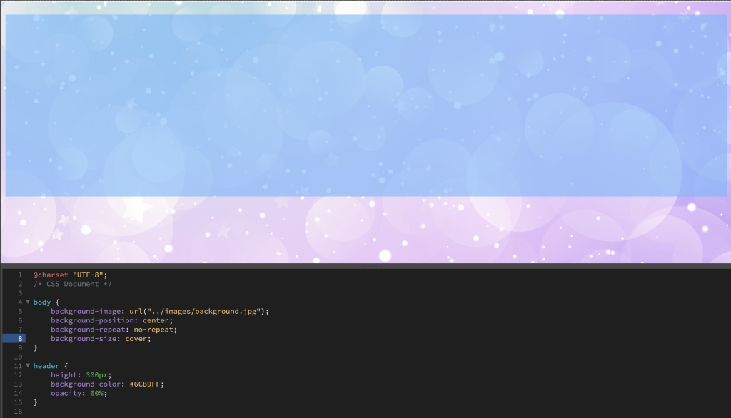
- A full-page background image that fills the screen using “background-repeat” and “background-size”.
Write a short description explaining how the property values changed the behaviour of the background image
Repeated
Centre
Full-page
HTML Code
CSS Code

Browser View

Upon applying my background image, by default, it positioned itself to fill the screen. I applied “background-repeat: repeat” and “background-size: contain” and was then able to view the entire background image repeated across the screen on both the x and y axis.
I then included a new property and value; “background-position: center”, changed the background-repeat value from “repeat” to “no-repeat”, and kept the value of the background-size the same. This positioned the background image right in the centre of the screen.
Lastly, I simply changed the background-size value from “contain” to “cover. This allowed my background image to fill the screen as a full-page image.
Part 2
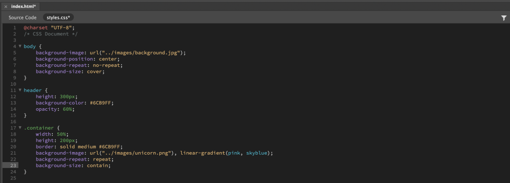
Brief: Insert a div with a class into the <main> section of the HTML page. Specify the div’s size using a CSS rule that includes a height and width property. You can also specify a border so that you can see the empty container.
Add a multi-layered background to the container that includes the following:
- A gradient.
- A pattern made up on the PNG image you collected earlier.
Write a short description explaining how the property values changed the behaviour of the background image.
CSS Code
Result
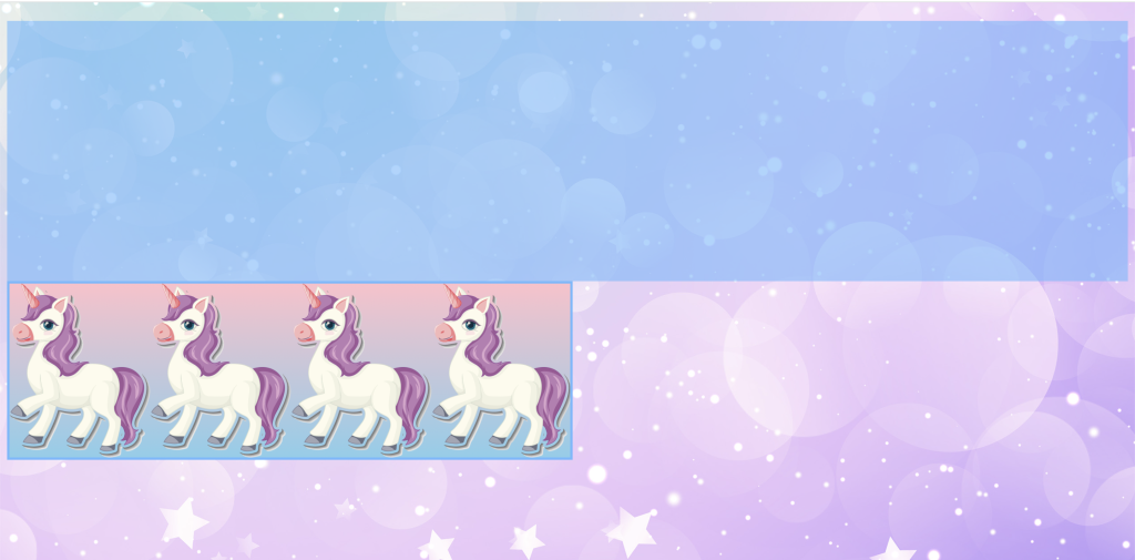
When I first applied my background image , only a small portion of it was visible due to the dimensions of the container, but after applying “background-repeat: repeat” and “background-size: contain”, the container was filled with a repeated image that fit nicely within the container and created a pattern.
Part 3
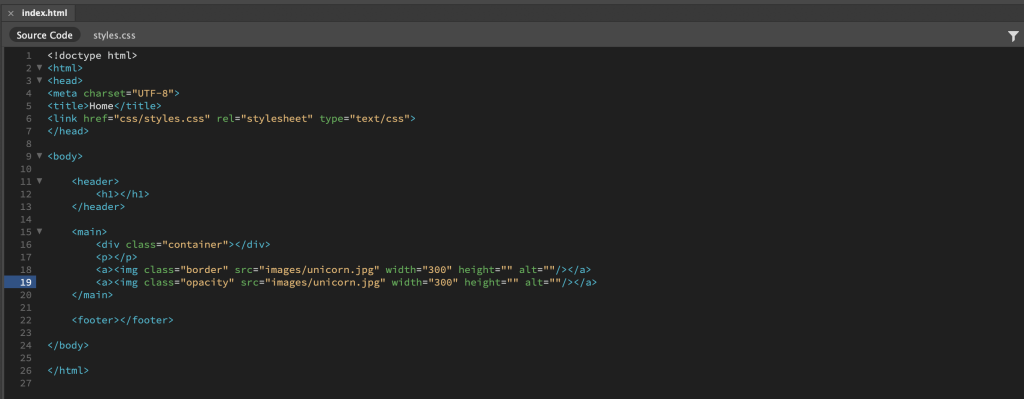
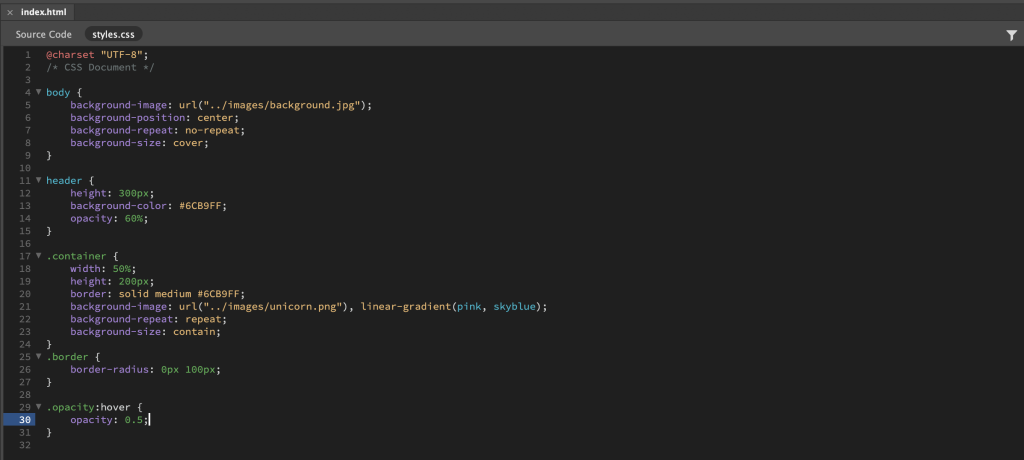
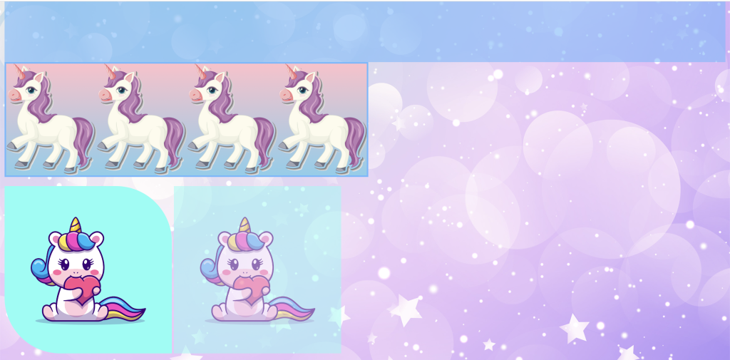
Brief: Insert two images in the <main> section using the <a> property in the HTML code. Using CSS do the following:
- Apply a border radius to the first image.
- Apply a pseudo-class property to the second image that reduces the opacity on hover.
HTML Code
CSS Code
Browser View
3.2 Lesson - Layout Element
You need to create an HTML and CSS document for this lesson task. Link the CSS file with the HTML document using the property inside the section of the HTML document.
Part 1
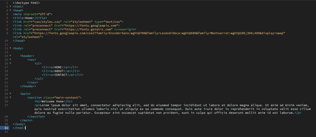
Brief: Copy the basic structure into the body of the HTML document and indent the code so that it shows the nested relationship of the content:
<header>
<nav>
<ul>
<li><a>home</a></li>
<li><a>about</a></li>
<li><a>contact</a></li>
</ul>
</nav>
</header>
<main>
<section>
<h1>Welcome Home</h1>
<p>Lorem ipsum dolor sit amet, consectetur adipiscing elit, sed do eiusmod tempor incididunt ut labore et dolore magna aliqua. Ut enim ad minim veniam, quis nostrud exercitation ullamco laboris nisi ut aliquip ex ea commodo consequat. Duis aute irure dolor in reprehenderit in voluptate velit esse cillum dolore eu fugiat nulla pariatur. Excepteur sint occaecat cupidatat non proident, sunt in culpa qui officia deserunt mollit anim id est laborum.</p>
</section>
</main>
Part 2
Brief: Using what you’ve learned so far, try to re-create the following browser display using CSS to style the above HTML:

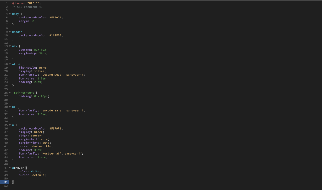
Here’s a list of things that should be included in the HTML/CSS:
- Classes
- Inline block display
- Margin properties
- Padding properties
- Font family
- Background colour properties
- Border properties
- Pseudo-class for the hover effect on the navigation menu
The font and colour may vary , but try to create a similar layout.
Write a short paragraph about what you’ve learnt, any difficulties you encountered, and how you managed to solve them.
HTML Code
CSS Code
Browser View
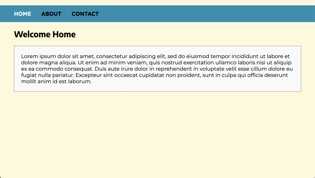
From this lesson task, I have learnt how to quickly and effectively style a piece of HTML content by using classes, inline-block, display, margin, padding, background colour, border properties, and font family and font properties, as well as applying a pseudo class to achieve a hover effect. It was a great lesson for putting all of these into practice. The only difficulty I encountered was with getting the unordered list items to display from a block to inline, but I soon realised that I needed to apply this property and value under a ruleset for “ul li” and not under “ul”.
3.3 Lesson - Styling Layout
Download the exercise files containing the basic HTML document, logo, and photograph. You will have to create a CSS document for this lesson task. Use one root folder to save the HTML file, and use separate CSS and image folders. Link the stylesheet to the HTML document using the link attribute in the <head> of the HTML document.
Goal
Brief: Look at this layout for a fictitious website advertising web development courses. Use what you have learnt to create the same layout (or as close to this as possible):
Brief: Using what you’ve learned so far, try to re-create the following browser display using CSS to style the above HTML:

Part 1
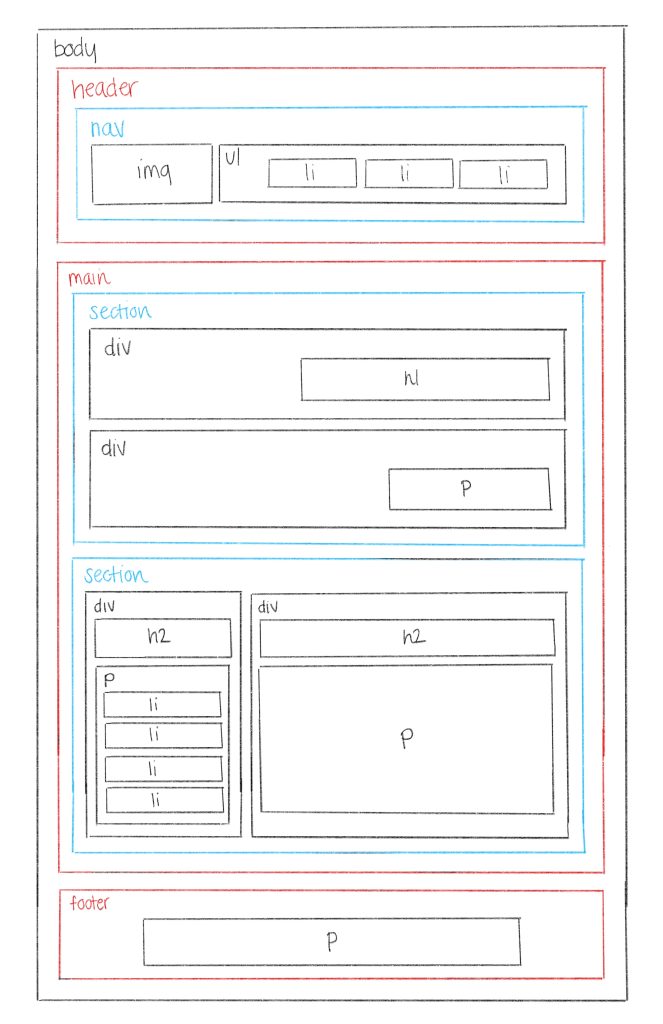
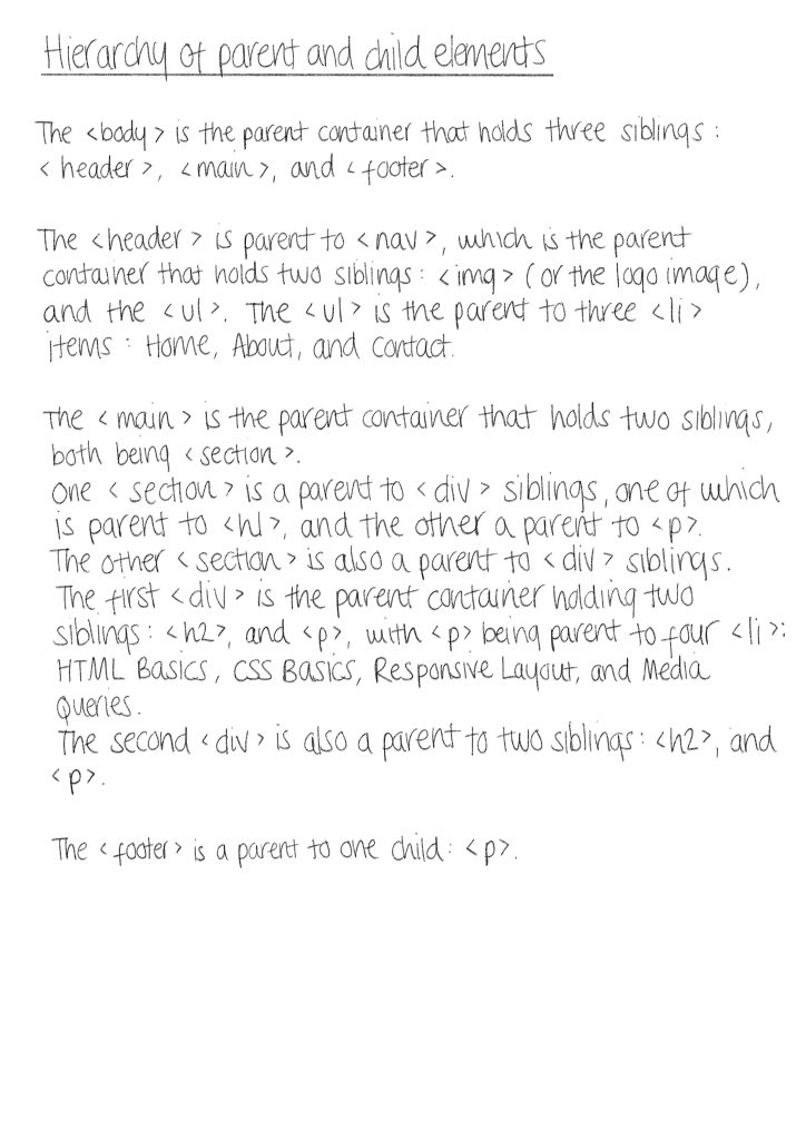
Brief: First, examine the layout and draw a wireframe showing the different sections of the page. Then, inspect the HTMl code to find the hierarchy of parent and child elements that respond to the sections you identified. Write down the names of the classes of the parent containers that make up the basic structure.
Wireframe
Parent Containers
Part 2
Brief: Start styling the different sections by assigning rulesets to the existing classes.
Write a short summary about how you think you could redo the example website. Comment on what you’ve learnt.
Header
Main
Main
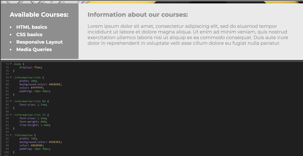
Footer
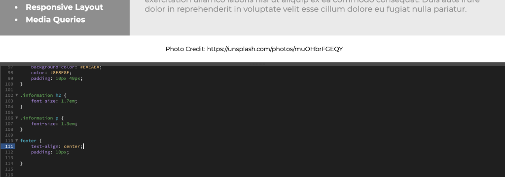
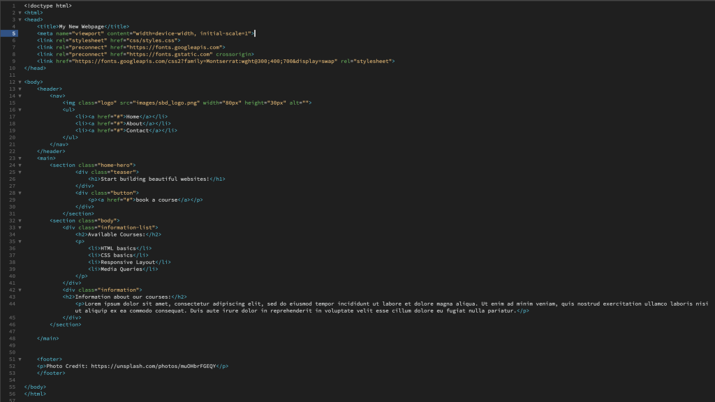
HTML Code
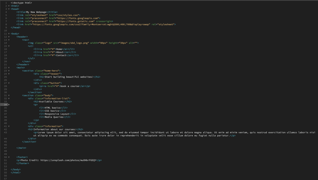
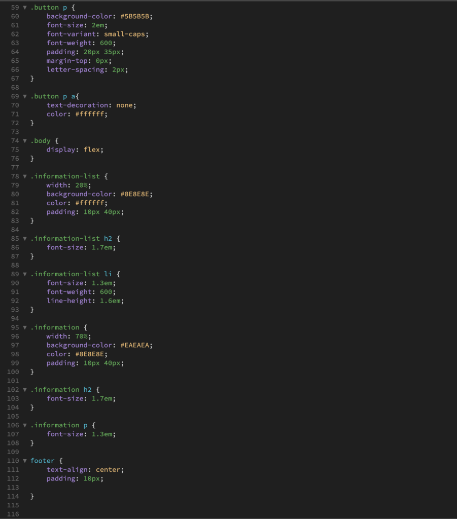
CSS Code
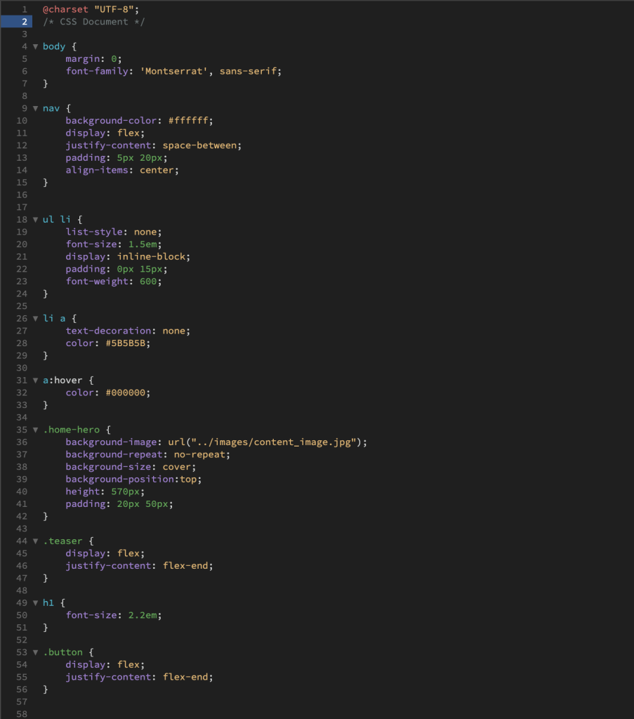
Result in Browser View

Below I have explained what I did in order to achieve my re-creation of the webpage shown in the example (I only looked at the solved CSS stylesheet if I couldn’t solve the styling myself):
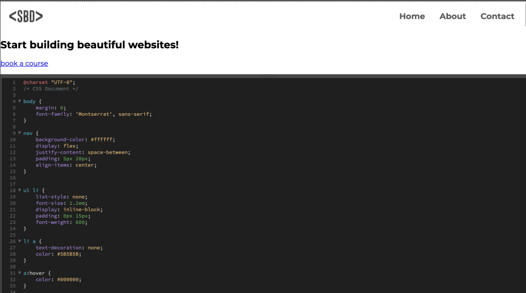
I first removed the margin on the <body> and applied a font family so that the same font would be inherited by all of the child elements. Next, I worked on styling the navigation, but first and foremost, I relinked the logo image. After applying “display:flex” to the <nav>, it squashed the logo image, so I simply added a height to it in order to reshape it. I then created a ruleset for <ul>, <li> and styled it accordingly, lastly applying a hover state to the <li> items.
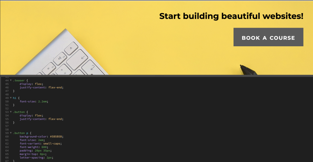
Secondly, I worked on the <main> section of the page. I began with applying a background image to <section class=”home-hero”>, followed by other background properties and also applying a height to the class.
I got a little stuck styling <div class=”teaser”> and <div class=”button”> with having them appear on the right of the page without them displaying as inline. In order to solve this I had to take a peek at the solved CSS stylesheet provided within the task.
Moving on to the <h1>, I only changed the font size.
To style .button p, I added a background colour and some font properties, as well as applying padding and margin properties and values.
In order to style the second section of the <main>, I targeted <section class=”body”> and set “display:flex” for the two child containers to display as a row. I created a ruleset for both of the <div> tags and applied a width property, background colour, font colour, and padding properties, then applied font properties to their child elements. (I got stuck again when using the tip to style this section with a grid, so that is why I have styled this section in my own way).
Styling the <footer>, I simply “align-text:center” to the <p> element and added some padding.
From this lesson task, I’ve learnt more about flex properties and how to use them effectively for positioning elements and content. Even though I failed to apply a grid and position properties to some elements (like the tips in the brief suggested), reading the solved code afterward helped me learn a bit more about them. I have also learnt a bit more about parent and child relationships (or “nesting” elements). In addition, this was my first time using the “em” value on the font-size property. I didn’t really know how to use it comfortable before, but now I can safely say that I much prefer using “em” over “px” or “pt” to define a font’s size.
3.4 Lesson - Media Queries & Code Conventions
For this lesson task, you’ll continue to work on the website you styled for SBD (fictitious website for web development courses) from the previous lesson task.
Goal
Brief: Using what you’ve learnt, add media queries to the stylesheet that will adjust the layout of the website to look like this on a mobile device:
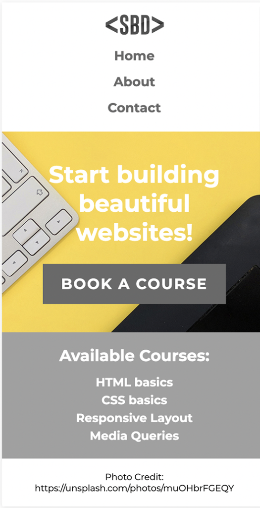
Explain what you’ve learnt.
HTML Code
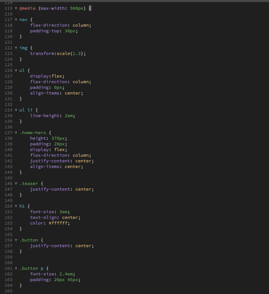
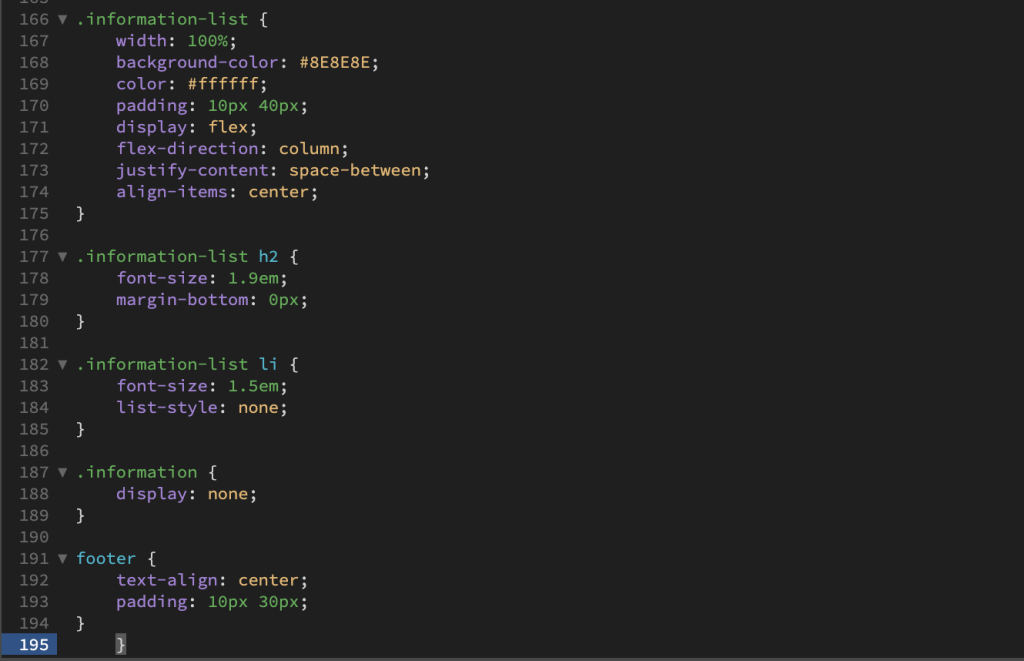
CSS Code - Media Query
Result in Browser View
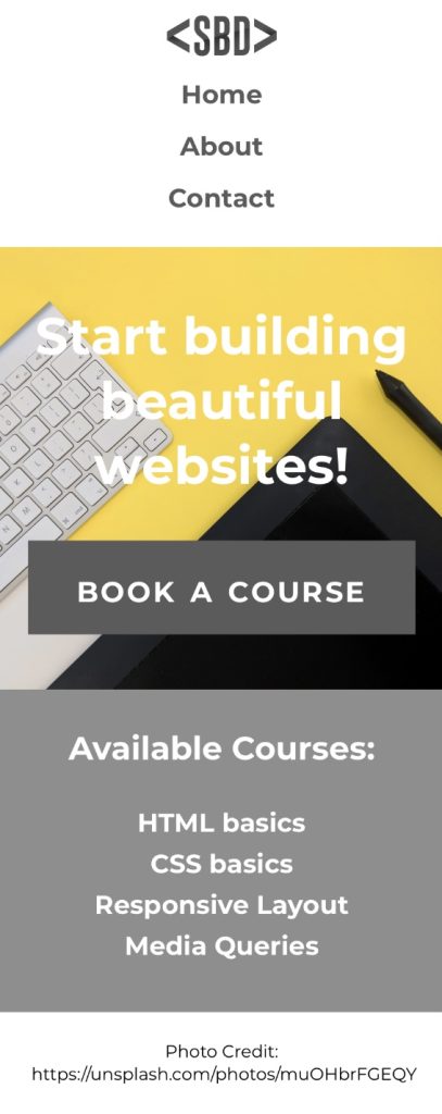
From this lesson task, I’ve learnt that in order to apply a media query to a CSS document and have a responsive layout work on a smaller device, you can simply do this by only changing a few properties and/or values (at least for a basic layout like this). I have also noticed and learnt that the flex property is especially effective and important when working with media queries.